Introduction
Web development has evolved rapidly, especially in the field of front-end development. In recent years, many new technologies and strategies have emerged, proving their success and shaping the way we program today. One of the biggest shifts has been in how we structure our applications.
At first, a project typically consisted of three main files: an HTML file for structure, a CSS file for styling, and a JavaScript file for interactivity. Each had its own role. But as applications grew larger, this strategy became difficult to maintain. Developers began splitting their programs into JavaScript and CSS modules, each handling a specific part of the app. A module bundler would then assemble those pieces into a single file for execution.
With the rise of frameworks and libraries like React, this approach evolved further. Instead of just modules, we now use components, self-contained building blocks that bundle structure, styling, and logic together. Components bring reusability, easier maintenance, and better debugging. In this article, we’ll explore this shift in detail, compare the different approaches, and highlight why component thinking is such a powerful way to structure modern applications.
The Evolution of Structuring Web Applications
File-based Separation
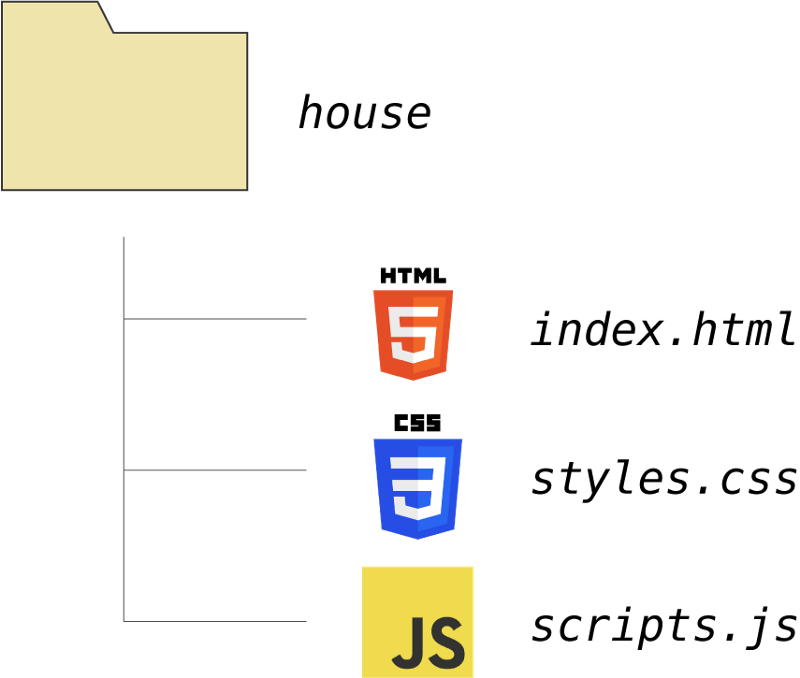
The first architecture used in front-end development to structure applications is often called file-based separation. Its core idea is to split the front-end code into three separate files, each using a different technology:
-
HTML file: Defines the elements on the page, such as text, inputs, buttons, and forms. These elements can be organized inside containers, forming the basic outline of the page.
-
CSS file: Defines how the elements created in HTML are styled. CSS controls colors, typography, alignment, spacing, and many other properties that determine how the website looks.
-
JavaScript file: Holds the application’s logic. JavaScript makes the page interactive by defining functions that manipulate HTML elements and respond to user actions, such as clicks or form submissions.
<!DOCTYPE html>
<html lang="en">
<head>
  <meta charset="UTF-8">
  <title>File-based Separation Example</title>
  <!-- Link to CSS file -->
  <link rel="stylesheet" href="styles.css">
</head>
<body>
  <h1>Hello, File-based Separation!</h1>
  <button id="clickBtn">Click Me</button>

  <!-- Link to JS file -->
  <script src="script.js"></script>
</body>
</html>
/* Styling for the page */
body {
  font-family: Arial, sans-serif;
  text-align: center;
  margin-top: 50px;
}

button {
  padding: 10px 20px;
  font-size: 16px;
  background-color: royalblue;
  color: white;
  border: none;
  border-radius: 5px;
  cursor: pointer;
}

button:hover {
  background-color: navy;
}
// Add interactivity to the button
const btn = document.getElementById("clickBtn");

btn.addEventListener("click", () => {
  alert("Button clicked!");
});
Although these files are separated, the HTML file links to the CSS and JavaScript files so that each can play its role. This approach worked well at first: responsibilities were clearly divided, and it was relatively easy to understand how the application was structured.
However, as websites grew larger and gained more features, each file became longer and harder to manage. Maintaining and debugging code became increasingly difficult. This limitation created the need for new ways to structure applications, paving the way for modularization and later, component-based development.
Modular Approach
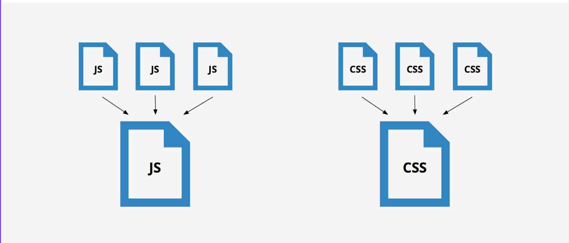
As applications grew and required more functionality, the file-based separation approach became harder to maintain. Each technology (HTML, CSS, JS) lived in its own large file, which made debugging and scaling very difficult. To solve this, developers introduced the modular approach.
The idea is simple: instead of separating code by technology, we separate it by feature. Each feature has its own JavaScript file (for logic) and CSS file (for styling). Then, we have an entry point (a main JS file) that imports all the modules, and a bundler (like Webpack, Vite, or Parcel) that combines everything into optimized bundles for the browser. These bundles may be a single file or multiple smaller chunks (through techniques like code splitting and vendor bundles) to improve performance.
This makes code easier to organize, debug, and scale.
Example: Modular Todo App
todo.js
// Handles Todo feature logic
export function addTodo(task) {
  console.log(`Added task: ${task}`);
}

export function removeTodo(task) {
  console.log(`Removed task: ${task}`);
}
todo.css
/* Styling for Todo items */
.todo {
  padding: 8px;
  border-bottom: 1px solid #ccc;
}
main.js
// Entry point
import { addTodo, removeTodo } from "./todo.js";
import "./todo.css";

addTodo("Learn Modular Approach");
removeTodo("Old Task");
A bundler like Webpack or Vite would then process these files, and output:
bundle.js→ all JS combinedbundle.css→ all CSS combined
This way, the browser still sees only two files, but developers work with multiple small, feature-focused modules, which is much easier to maintain.
Component-Based Architecture

With the introduction of modern frameworks and libraries such as React and Vue, the way applications are structured changed significantly. Instead of separating code only by type or feature, developers now break down the UI into small, reusable blocks called components.
Components represent specific parts of the webpage and allow developers to build applications in a more maintainable, scalable, and reusable way.
In React, components are typically written using JSX (JavaScript XML), a special syntax that looks like HTML but can live inside JavaScript. This means you can describe what the UI should look like using familiar tags (like <h1> or <button>), while still being able to use JavaScript expressions inside curly braces {}. Behind the scenes, JSX isn’t HTML, it gets converted into regular JavaScript function calls that React uses to build the actual UI. Unlike the modular approach, components encapsulate both structure and behavior, making them more powerful and efficient.
Example (React Component):
// Button.jsx
import './Button.css';

export default function Button({ text }) {
  return (
    <button className="btn">
      {text}
    </button>
  );
}

// Button.css
.btn {
  background-color: #007bff;
  color: white;
  padding: 10px 16px;
  border: none;
  border-radius: 6px;
  cursor: pointer;
}
// App.jsx
import Button from './Button';

export default function App() {
  return (
    <div>
      <h1>Hello React</h1>
      <Button text="Click Me" />
      <Button text="Submit" />
    </div>
  );
}
Separation of Concerns: Old vs New
The principle of Separation of Concerns (SoC) is about dividing your application so that each part has a clear, single responsibility.
-
Old way (Vanilla JS with file-based separation): SoC meant splitting files by technology: HTML for structure, CSS for styling, and JavaScript for logic. This worked well for small apps but became harder to maintain as files grew larger.
-
Modern way (with components): Frameworks like React and Vue redefined SoC. Instead of separating by technology, developers separate by feature/UI block. Each component groups together the code relevant to that piece of the UI, which keeps logic, structure, and styling closer to where they’re actually used.
So, while the file-based approach applied SoC at the technology level, the component-based approach applies it at the feature/UI level.
Benefits of Component Thinking
The component-based approach has reshaped how web applications are built, making development more efficient, scalable, and maintainable. Some of its key benefits include:
- Reusability: Components can be written once and reused multiple times throughout the application, even with different data inputs. Just like functions that accept arguments, components accept props (inputs) and adapt their behavior or output accordingly. This eliminates code duplication and improves efficiency.
// Button.jsx
export default function Button({ label }) {
  return <button>{label}</button>;
}

// App.jsx
import Button from "./Button";

export default function App() {
  return (
    <div>
      <Button label="Save" />
      <Button label="Delete" />
    </div>
  );
}
- Encapsulation: Each component manages its own structure, logic, and styling in an isolated way. This prevents unintended “leaks” or side effects between different parts of the application, making the codebase easier to maintain and debug.
// Counter.jsx
import { useState } from "react";
import "./Counter.css";

export default function Counter() {
  const [count, setCount] = useState(0);

  return (
    <div className="counter">
      <p>{count}</p>
      <button onClick={() => setCount(count + 1)}>Increment</button>
    </div>
  );
}

/* Counter.css */
.counter {
  border: 1px solid #ccc;
  padding: 10px;
  display: inline-block;
}
- Scalability: Large applications can be modeled as a tree of components that interact with each other. This hierarchy makes it easier to scale projects since new features can often be added by creating or extending existing components.
// App.jsx
import Header from "./Header";
import TodoList from "./TodoList";

export default function App() {
  return (
    <div>
      <Header title="My App" />
      <TodoList />
    </div>
  );
}
- Readability: Components improve readability by keeping related code together in a single unit. For example, React’s JSX allows developers to write HTML like structures directly inside JavaScript files in a simple, declarative, and consistent way, reducing repetition and making the code easier to understand.
// Greeting.jsx
export default function Greeting({ name }) {
  return <h1>Hello, {name}!</h1>;
}
- Testability: Components can be tested independently in isolation. Tools like Storybook allow developers to preview and test components in their own environment without running the entire app.
Component Hierarchy in React
A React application is structured as a hierarchy of components, starting from the root (App) and branching down into smaller components. Each component can contain other components, which makes the app composable and modular.
Example of a Todo app hierarchy:
App
├── Header
├── TodoList
│    ├── TodoItem
│    └── AddTodoForm
└── Footer
The relationship between components in React is a Parent–Child Relationship:
-
The parent component contains the child.
-
Communication happens through props, which are like function parameters.
Props allow two main ways of communication:
1. Parent → Child (data flow)
Data flows downward from parent to child. This is unidirectional, the child can’t directly change the parent’s props.
// Parent.jsx
import Child from "./Child";

export default function Parent() {
  return <Child message="Hello from Parent!" />;
}

// Child.jsx
export default function Child({ message }) {
  return <p>{message}</p>;
}
2. Child → Parent (callbacks)
To communicate upward, parents can pass callback functions as props. The child calls the function to send information back.
// Parent.jsx
import Child from "./Child";
import { useState } from "react";

export default function Parent() {
  const [count, setCount] = useState(0);

  function handleIncrement() {
    setCount(count + 1);
  }

  return (
    <div>
      <p>Count: {count}</p>
      <Child onIncrement={handleIncrement} />
    </div>
  );
}

// Child.jsx
export default function Child({ onIncrement }) {
  return <button onClick={onIncrement}>Increment</button>;
}
This two-way coordination (data down, actions up) is the foundation of React’s component hierarchy.
Conclusion
The way we structure web applications has come a long way, from simple file-based separation, to modularization, and now to component-based architecture. React’s component thinking isn’t just a new syntax; it’s a mindset shift. By grouping structure, logic, and styling into self-contained units, developers can build UIs that are reusable, maintainable, and easier to scale.
Understanding concepts like Separation of Concerns, component hierarchy, and parent–child communication is key to mastering modern React development. Once you begin thinking in components, your projects become more organized and flexible, making it easier to add new features or adapt to changing requirements.
In short, components are the building blocks of today’s UIs, and learning to think in components is one of the most valuable skills a front-end developer can have.